|
Secrets of Channel Operations: |
|||||||||||||
|
Why? |
Channel operations are definitely the unsung hero of Photoshop. There are amazingly powerful methods to create effects that simply could not be created any other way, no matter how good you are with that Wacom airbrush... Since the Adobe documentation has only 4 pages on this subject and even the PS book only 12 (although both are generally excellent!) there are plenty of secrets, examples, techniques to be shared here. This is NOT one of the One Minute Quickies, but is worth every minute of your download, reading and “try-on-your-own” time... (Especially the latter - this is NOT a short story to READ. It’s a how-to....) Rather than a dry lecture on internal math or abstract concepts, I will describe particular real life case studies and apply a number of Chops as needed. I may digress from time to time into tangential subjects, there may be a bad pun here or there, especially there. Tough cheese. |
||||||||||||
|
What? |
The old drop shadow is beginning to be THE most overused graphic technique, but still: life ain’t flat and to some degree there will be light & shadow in just about any image. I will start with the drop shadows, but progress into much more complex territory beyond that. Either way, it’s up to you to use the tools for ‘goodness, not evil’. Teaching chord progressions should not be held responsible for Muzak. In the book and manual “Alpha Channels” are mentioned in conjunction with these calculations and they are often dealt with as ‘selections’ of the main image. I use them somewhat differently and may stray from the traditional ways and naming conventions. Ok, first up is a new concept I termed “Shadow/Highlight Multipliers”. The basic technique is quite straight forward and I cannot stress enough how useful it is, at least to me. This may look like a terribly complicated surgical operation if you just fly across it, but the actual process would take less than 30 seconds once you figured it out. |
||||||||||||
|
How? |
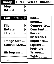
The effects can be generated at any size, exact numbers are only examples provided for repeatable results. There are a few basics that need to be covered as we go along. 1) Go to and create a 400x300y window, Gray Scale, 72 dpi. Under the menu you will find these 11 options. Note: the Calculate commands are greyed out in the Indexed Color and Bitmap modes.
|
||||||||||||
| Tip |
The most basic fact one needs to understand is that they work ONLY if the sizes are IDENTICAL. If you try to blend two files that are off by even a single pixel you won’t even get to SEE them in the pop-ups... | ||||||||||||
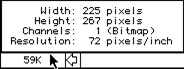
| The quickest way to check on the sizes is by option-clicking on the ‘Size’ box, next to the bottom scroll bar, to get the little info window:
Then you can scale one of the images to conform to that size using |
|||||||||||||
| Tip |
The fact is, though, that these operations are not exactly all in the same class, even though they appear in the same menu. Duplicate works on a single channel, while Composite works on three and the others compare two. While there are pairs such as Add/Subtract and Lighter/Darker, each of the others is quite unique. There is simply no global explanation...
|
||||||||||||
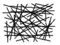
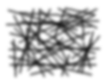
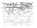
| 2) Lets just jump right in. Many techniques describing subtle shadows start with a trivial piece of text which is a selected region that simply gets pasted onto a displaced copy of itself. Easy enough if that's all you need. Other times there are airbrush techniques. But what if you have a complex image (as this rather goofy and meaningless example): Now selection, magic wand, pen paths & airbrush are all inappropriate!
|
|||||||||||||
| 3) Draw something similar with the brush. Keep it plain black for now, but crisscross any way you like... | |||||||||||||
| 4) Select and click “ok”. The default settings will create a copy of the first window, now called “Untitled-2” (or as I refer to them shortly ‘U-2’ (unless you did other work and are up to “U-133” by now...(My personal record)) | |||||||||||||
| Tip |
The fact that this is an ‘exact same size window’ in Gray Scale makes Duplicate an ideally suited method to work with Chops. I have a Quickkeys macro defined for “Command-D” that takes the current window and simply duplicates it (and includes the click-OK step....) |
||||||||||||
| 5) This first copy will become our shadow. You could keep it as is - a hard cast shadow, but the technique comes really into its own with the possibility to get very realistic soft blend shadows. Use or better yet set to 2-5. These tiny examples using Blur More look roughly the same as a large version using Gaussian at 3...
|
|||||||||||||
| 6) Lets move the shadow for more realism. Enter x: 6 and y: 4 Ok. (In the tiny samples its only 3 and 2) | |||||||||||||
| Tip |
Try not to use identical offset values, as a displacement in exactly 45 degrees can create artifacts such as moirés; also: clean diagonal lines would not have any visible shadows along their length. | ||||||||||||
| 7) Go to |
|||||||||||||
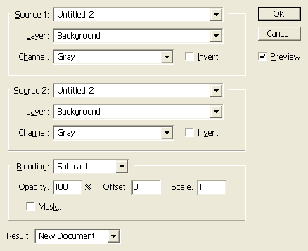
8) Lets look at this for a minute. Basically there are two images, Source 1 & 2, and a Destination. All of these have a ‘Channel’ popup underneath. If we were dealing with full color images these channels could be either RGB, R, G or B separately. In Gray Scale the pop-up shows only a #1 (more only if you merge or add new channels, which we won’t do for now.) Note : There are two basic methods to use the calculation commands: Generate new windows in separate files or generate multi channels inside one file. I will use individual separate files mostly, but there are reasons for both. Specifically all channels will only work together with identical dimensions. If all channels are inside one file they all get scaled or resized together in synch. On the other hand, such multi channel files can only be saved in the native Photoshop format, which is larger than say Pict or Gif. There is also more freedom to save, load, update and view individual files. Saving with Jpeg for instance will not work with multichannels.
|
|||||||||||||
| Tip |
As shall become apparent I often have literally dozens of masks and multipliers to create a single image. For simplicity of housekeeping I often combine them all afterwards into one huge multi-channel file for archiving. During work, though, I prefer individual files. | ||||||||||||
| 9) Note that the currently active window name is already inserted for you. If you click on Untitled-2 you will see all files that can be operated on (i.e. all of equal dimensions and compatible modes) | |||||||||||||
| Tip |
If the image you want to blend, add, etc. does not show up in the pop-ups, the size does not match the currently active window, or it is in an incompatible mode (e.g. Indexed...): Resize and change Mode to Gray Scale or RGB. | ||||||||||||
| Even with an 8 bit card Photoshop works internally in 24 bits. In RGB mode the image may look dithered, but it retains all subtlety. Changing over to Mode > Indexed Color...will look momentarily cleaner, but is infinitely less subtle inside. You should always do all work in large size RGB mode and only create an additional, separate Preview version of the final art that is dithered to an Indexed Color (256) palette at the screen size. | |||||||||||||
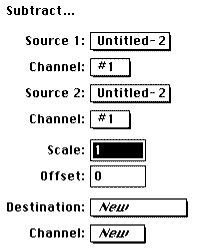
| 10) Now: We need to subtract the shadow from the clean original. Think of the Subtract dialog as: Top popup (Source1) minus Bottom popup (Source 2) saved into Destination popup (here usually a NEW file). This means that you should click on the top popup and drag up to put “Untitled-1” in there. ( I wish there was an easy way to name the windows short of saving them in PS format...). Click Ok. | |||||||||||||
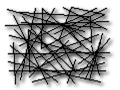
| 11) Slight hitch: the resulting file will still need to be inverted. (should be an option in the Subtract dialog) Use Image > Map > Invert, or simply Command-”i”. Voila, our Shadow Multiplier:
To describe in other words what happened here: We cut all parts that are black in U-1 out of the image in U-2 and put that into U-3. U-3 now contains what I call the Shadow Multiplier: only information about the shadow which will not interfere (by definition) with the original artwork. It can now be added to (actually ‘multiplied into’ any other version of the original art, even if that art sits on complex textures, color backgrounds, blends, etc...(and THAT is the difference to traditional “paste region over offsets”, as we will see. In this simplistic example the power is not yet obvious.) |
|||||||||||||
| 12) Instead of “Add...” we need to use Image > Calculate > Multiply... (We’ll cover Add... later) Multiply U-3 with U-1 | |||||||||||||
| Tip |
If you are strapped for space, select U-2 as the destination now; the blurred U-2 was only a step to get U-3 and is now dispensable. But normally “ok” will create U-4: the original artwork with a displaced soft shadow- Quod Errat Dropshadundum...
|
||||||||||||
| To sum this up and prove the point that it is quite easy and fast: Original art, duplicate, blur, offset, subtract from original, invert, multiply back into original, done.
You should think of Multiply U-3 with U-1 as : whatever is black in U-3 will be added to U-1. Where U-3 is white, you will get the clean U-1 with nothing added. Whatever is an in-between shade of gray in U-3 will just darken U-1. In another way: if you multiply a solid black image with U-1 you will get solid black. If you multiply solid white, you won’t affect the image at all and you get U-1. The manual describes it as “ using a transparency overlay on a light table”. Now the fun really begins. Once you have that Shadow Multiplier you can go to town and add it to anything But while we are talking about similarities, let’s use the cousin of Multiply: “Screen...” |
|||||||||||||
| 13) First we create a background with the Blend tool. Use ( |
|||||||||||||
| Tip |
To clear a marqueed region hit ‘delete’, to clear a window double click the Eraser tool ( |
||||||||||||
| Fastest way to set the background color to white (as well as foreground to black) is to double click the Eyedropper tool.
|
|||||||||||||
| Tip |
Read the ‘Have A Ball..’ document about more Blend tool tips. It talks about spheres, but the hints are applicable for linear backgrounds as well... This one uses two blends, the first top to bottom at Opacity = 100%, the second goes bottom to top with Opacity set to 20%.
|
||||||||||||
| Often overlooked: you can set the transparency simply by holding down the “1” through “9” keys... for 20% that's the “2” key, very easy and much faster than setting it in the dialog. | |||||||||||||
| 14) Now we can ‘stencil out’ this gray ramp into our original shapes: Use (
Aside from all the math descriptions and analogies, I suggest you remember some of the Chops simply in terms of specific operations. If you take two color images and randomly try to screen, subtract, multiply etc. you will get pretty strange results, maybe sometimes an unexpected bit of creativity, but certainly not anything resembling a usable tool. If you use Gray Scale for image A and Grayscale, RGB or CYMK for B then there are repeatable and very useful applications for all the Chops. This would be the summary so far : (We will cover all the other channel operations in other documents)
Note > The Gray Scale image can of course contain all shades of gray and the description above applies to solid black and has to be linearly extrapolated for those in-between shades. White will essentially have no effect at all and a medium grey will have a translucent blend effect. Experience helps. |
|||||||||||||
| What Else? | |||||||||||||
| Tip |
One implication of the process is that you may want to tone down the solid blacks in the multiplier. Do this with the dialog and move the bottom left triangle to the right.
This is a very valuable little operation! You may think of it as ”make the blackest black not so black” without affecting the rest of the image very much. Conversely, if you move the bottom right triangle toward the left, it is the “make the whitest white not so white” tool... |
||||||||||||
| The two combined get you a perfect ‘Toning Down” process, if, for example you want to put a subtle background image behind text. In a CD booklet I added subtle color images toned way down behind plain black text. Create your images in full color and tone down as the last step, rather than trying to create the image itself using only a muted colorscheme. Much easier! Once you have a toned down Shadow Multiplier you can vary the intensity with repeated multiplies. | |||||||||||||
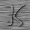
| Let’s show the power of the multiplier and extend it to highlights as well. I will use a more complex source image:
This Ambigram (don’t get a headache) is courtesy of Scott Kim. His book “Inversions” is magnificent! He also has a Macintosh puzzle/game collection called “Letterforms and Illusions”out. You can reach him on AOL under screen name ‘Scott Kim’! - Also check out his web site. |
|||||||||||||
| This is a cleaned up scanned version of a faint pencil sketch in a copy of the book. I will explain in a separate document how to clean such files and faxes, as it is very useful indeed. This is about as clean an edge as can be had at 72 dpi 8 bits...Look for the doc on it! | |||||||||||||
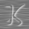
First the same sequence to create the shadow multiplier:
K1, Duplicate to K2, Gaussian Blur (‘3’), Offset (3x 2y), Subtract K2 from K1 to get K3, Multiply K3 with K1 to get K4. Could you do it in 30 seconds by now? So far so good. The powerful extension comes by the realization that if you can ‘multiply a shadow into any picture’ that you can use and inverted version to ‘multiply highlights into any picture’ as well. The advantage of this process is hard to see on these thumbnail sketches (see more complex examples such as Turbulence or the Yes Logos), but you are essentially painting with light and shadow and you are doing it without airbrushes or manual selections, but algorithmically with masks and channel operations. |
|||||||||||||
| Tip |
By implication the algorithmic method works with any size image and I commonly will do exploratory sketching with small sections of an image (better than a resized convoluted version of the entireimage!) such as the “K” above. Then I record every step into a Quickkeys macro and simply replay the macro with the full resolution final image. Such a “re-rendering” can then take hours but is completely automatic. Just be sure you have the disk space, and that Filter operations, which are RAM limited, work on the full image. Also, restart Photoshop so that the initial image will for the macro will have the same name and position in the Chops popups as the tiny placeholder did. ( |
||||||||||||
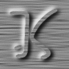
To create the matching highlight multiplier we can even re-use K2, the Blurred and Offset version. We need to offset it symmetrically to the upper left though. Since there are interesting combination effects in store for the offset blur, we Duplicate K2 first, yielding K5. Now K5: -6x -4y (back from 3x 2y to zero and then minus that again). Same Subtract: K5 from K1 yields K6, then don’t forget to invert and you get the Highlight Multiplier.
The really cool thing is that between the shadow and the highlight you can now define the original shape out of any texture, with a ‘negative space’ (not drawing the shape but drawing all around its edges until you see the shape). For example, this is a texture (derived from the method in the “Instant Aluminum” note)
|
|||||||||||||
| Tip |
It works best if the texture contains many medium gray shades so that both light and shadow modifications can be distinguished. The larger the shape (and the shadows) the less this is necessary, but in this tiny example with the small shadows it helps a great deal to have lots of gray. | ||||||||||||
To multiply the shadow into it is trivial now. K3 times T1 gets K7:
|
|||||||||||||
| Tip |
If in this step you want darker shadows without touching up the whole image, just repeat the Multiply: K3 times K7 (To save space you can set Destination to ‘K7’ and Channel to ‘1’ instead of ‘New’, it will then overwrite the first version of K7. You can always use Command ‘z’ UNDO for a quick comparison. | ||||||||||||
| If you forget which way you switched look under Edit : it will say Undo after change or Redo if you switched back... | |||||||||||||
|
Now for the Highlight Multiplier: There is no channel operation that would multiply a light area into an image. So we need to multiply the dark (inverted) version of the highlight into the inverted version of the image. No big deal, K6 is already inverted. Now we invert K7
and Multiply it with K6 to get K8, which we then have to invert one last time back to the final positive:
Did you get that? We just used the two multipliers without the original artwork to emboss the shape out of a texture file. Of course now that can be ANY texture or image! You can create those fancy chiseled marble effects and a zillion others. This tiny example does not do it justice, look at some of the sample files (and even those are small screen jpegged or 8 bit... The subtlety and major advantage over other methods truly shines at 2000 line 24 bit files..). And really we are just beginning to get into it now! We have 9 windows open: 2 multipliers, 1 original filled mask shape (as I called the solid black figure), 2 offset blurs, 1 texture and 2 combinations and one ‘final’ version. That is NOTHING. As mentioned above for the main Turbulence CD poster file there were a total of 133 steps with dozens of combinations, and probably every Chop used several times over. Still, this is an essential part of the process and a universal technique. To illustrate how Chops really come into their own especially when you start combining them sensibly, look at these quickie metamorphoids: If you use Blend between the final K8 and the earlier blurred K2 you get this (after levels adjust..)
Lets get another useful Lego block into the action.Duplicate the blurred K2 and use (
Multiplying an inverted K10 with the clean K4 gets this:
Such soft halo backdrops are not easy to do with other methods. (OBVIOUSLY this all works with color images...it just gets these documents too big to download) Using “Difference” between the inverted K10 and K11 gets this:
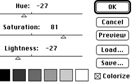
This is the perfect Candy Apple Neon Effect! All you have to do is to go to convert to RGB, then go to and set the sliders to:
and get a perfect neon glow... (Great Colorization tricks in another document) The Soft Halo, Glowing Neon, Embossing Marble are all just a few Chops away. Once you understand how the process works and which tool is responsible you can go after such effects deliberately. |
|||||||||||||
| Tip |
You can even have a QuickKeys MACRO defined that creates the complete multilayer effect automatically for “any black blob!” starting image, at any size or resolution! Kind of 2-D rendering... |
||||||||||||
|
Lots more to come! There is a final colorized multichannel example of the ambigram above, done as a large 24 bit image, but resized and jpegged down to 640x370. Worth a peek...it’s in the Photoshop > Images area... PS: You could add a note in the feedback folder mentioned at the top if you have results to share with others. Please let AOL and Adobe know if you find these tips useful. Happy Photoshopping, Kai Krause |
|||||||||||||